Media Molecule : Company creators of Little Big Planet, Tearaway and upcoming Dreams. Amazing website. Variety of concept art
Monster Boy : Video game by FDG Entertainment. Similar to Shantae. Anime cut scenes. Quality over quantity.
Tequila Works : The Sexy Brutale, Rime, Groundhog Day, Gylt
Friday, 24 January 2020
Wednesday, 22 January 2020
Turnarounds!
Ceramics Turnaround

Version 1: I think that his face might be a little bit flat, and his stomach could be rounder to emphasise he is a chubby and loveable elf. So he looks less like a familiar Harry Potter, as created unintentionally, I think the plumpness will help. I may also alter the skin tone on my design to a more earthy tone.

Version 2: Constructive criticism that I found was that people thought my character should have a hat to pull together the carpenter feel. I think that the yellow feather adds a nice bit of contrast to the very similar colour palette, whilst bringing in the theme of creatures and nature still. I was also recommended to add a belt, but I wanted to maintain the elf's plump image, so I added the belt to the front pouch.
Animation Turnaround

For my crime themed character, I created a traditional mob boss henchman sort of character who could easily play a role in any story that I think of for my animation. I think that I would like his chest to look more square, however I think with the arms down, this will look more as I envisioned. I also think that he will mostly walk and stand straight with his hands by his side, so his more realistic convex chest will probably look better as a design overall.
Friday, 17 January 2020
Animated Shorts
"Justino" - A Spanish Christmas advertisement for the 'El Gordo' lottery. As this is an advert, my initial impression was being astounded by the level of detail in the animation. I also felt that it had a nice story.
"One Small Step" - By Taiko Studios which is run in both L.A. California and Wuhan, China. I love the style in their studios' work overall and I think this story is both moving ad relatable for anyone trying to make their family proud.
"Children" - This short film was one of the first I found before coming to university. I last watched it three years ago now, and it has always remained in my mind because of the unique character the design, and the sinking feeling in my stomach that arose the second it began. This short clearly shows the conformity in Japanese schools and the pressure to maintain the highest level grades - and how the schools maintain this by balancing everyone's results, ignoring talent. Everyone has the same mind and produces the same work, so they are hard to tell apart.
Autodale: An Animated series of short films (Playlist)
This Youtube animated series is twisted and has no relation to the audience at all, but it's interesting to watch as each short adds a new layer on to what you can see in the background of other episodes before it.
"Noose" - an end of year undergraduate film about suicide which represents how a loss of a life can impact others', and that there's something worth living for, even if you doubt it. I like the backgrounds in this animation a lot, and I think that the style of the person is similar to what i have produced so far, which proves that I could create something like this too.
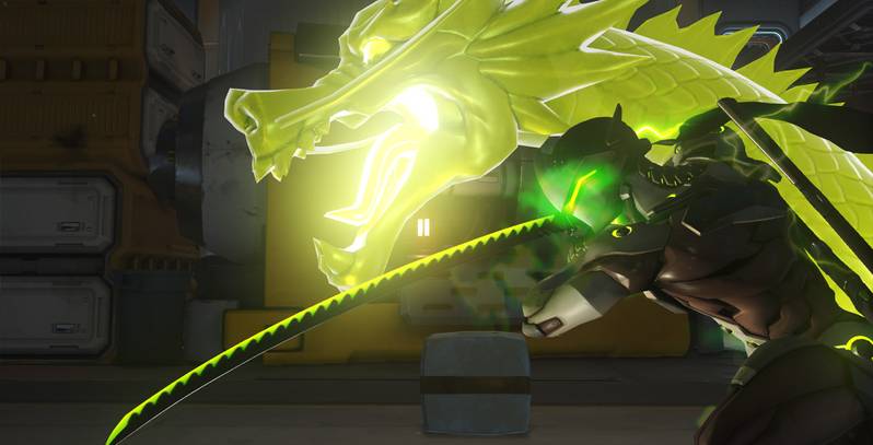
Overwatch Animated Shorts (Playlist)
The Overwatch animated shorts have been used as a great marketing tool for the game, as most people can at least recognise the initial trailer even if they haven't played the game. The shorts allow all of the characters to interconnect and give them all a backstory, which has been so loved by fans that it is interwoven in to the game through secret character interaction dialogues, and outfits. For most people, this trailer was the best thing to come out of Blizzard Entertainment, and the shock of the air at Blizzcon made the game viral before it was even released.
"Traces" (The full animation was shown at Manchester Animation Festival on Wednesday the 13th of November 2019) - This animation uses a painted texture to symbolise paint on a tribal cave wall. The French animation shows clear conflict of morals and duty and family bonds.
Passage by Simon Feat - New Chitode Airport International Animation Festival 2018.
(Not a short!! Animation company: Toei Animation. Makes Transformers TV shows, Yu-Gi-Oh, Sailor Moon, Digemon, Voltron (1984))
Passage by Simon Feat - New Chitode Airport International Animation Festival 2018.
(Not a short!! Animation company: Toei Animation. Makes Transformers TV shows, Yu-Gi-Oh, Sailor Moon, Digemon, Voltron (1984))
"Chinese Animation": Library 2


Tuesday, 14 January 2020
Character Design
Random body parts, in 2 minutes for each category!


Whenever I create a character, I always first create them out of shapes. Only thinking about shapes for the posture was strange- because I would usually create the entire shape structure first and insert body parts around that. Doing things the other way around was tough because usually drawing the facial features goes well for me, but adding in a face shape around that ruins it. I think this time it went well.


Whenever I create a character, I always first create them out of shapes. Only thinking about shapes for the posture was strange- because I would usually create the entire shape structure first and insert body parts around that. Doing things the other way around was tough because usually drawing the facial features goes well for me, but adding in a face shape around that ruins it. I think this time it went well.


I think that all of the random facial features I drew either ended up in my style that I'm naturally comfortable with, or in a cutesy cartoon style that was quicker to draw in the time limit. If I did this again, I would add some features that I wouldn't necessarily have thought of using.
Once we did the faces, we thought of posing. This was also hard because I had ideas of poses for the characters personalities, but knew they would not be right to even put on the page because of the directions that I drew the heads. I would rather my woodland creature was doing an energetic pose or creating something. I think the pose for Chase suits the character and I am happy with it, but I didnt have many ideas other than the one I used.

Sunday, 12 January 2020
Library Research

Magazines
Imagine FX
Lauren Covarrubias from USA combines 3D
work in ZBrush with illustration in Photoshop.

__________________________________________________________________________________

(Non digital media) I really like the effects that he makes.


________________________________________________________________________________
 Oksana Kerro is a Russian
character designer who uses
pencil sketches over
digital work.

Dongulu Yu is a female concept artist working
industry, best known for
Assassin's Creed Black Flag.
She's from Canada and uses Photoshop.


______________________
_____________________________
____________________________
3D Artist

___________________________________________________________________________________

games


Cuphead revived the old cartoon art style that was most common in early Disney.
The handrawn animation encourages this,
in a similar style as to what Disney used in
their own animations.
______________________________________________________

___________________________________________________________________________________

Mateusz Urbanowicz is an artist from Poland who achieved a Japanese style through studying over there. He is now a background artist for the Japanese company Comix Wave Films. The illustrations maintain the Japanese style of ink on watercolour.
 This style reminds me a lot of
the video game Attack of
Monday, 6 January 2020
Slapstick: Animatic and Sketch Layer
I do not think I understood the true purpose of an animatic. I placed together the drawings made in my storyboard and pieced them together in Premiere Pro; fudging the timing inbetween. I think I could improve this by attempting the falls inbetween the large gaps or inserting experiments that I have done of hand waves etc where needed.
My sketch layer was done in Adobe Animate, and I think the tweening in this software helped with making the walking motion straight. The problem is that sometimes the stationary foot in the walk cycle will move, so I will need to avoid following this movement in the main animation. I used animate mostly for the panning and zooming in my work, as I understand the camera features best on here. Despite, I will be doing the main line work and colouring in photoshop, as I do not feel as confident creating steady line work in this software.
Slapstick Cartoon Slipping
In my animation, I wanted to make the human's slipping motion seem quick and realistic in comparison to the banana's which I wanted to feel cartoonish.
I used this gif as reference as to how to make the feet act as I wanted it to.
I found this quite simple to animate and it was a good transition in to the 'Wheel of Feet' that I wanted to include originally.
I used this gif as reference as to how to make the feet act as I wanted it to.
I found this quite simple to animate and it was a good transition in to the 'Wheel of Feet' that I wanted to include originally.
 |
| Website |
However, the continuous side view of the whole of my animation makes this forward movement look like a continuity error. Therefore, I left it out.

Original idea during storyboarding
Slapstick Animatic, Plans and Colour

My plans for this project are to create a timeline of looping events. I hope for the banana thrown at the end to land in the same spot as the original banana on the floor, however I will see if this can work once I have added in panning and tweening.
I plan for the banana to be bigger than a normal one, mostly so it is not ignored as a focus throughout the animation. I hope for the colour palette to help with this, by using a bright yellow for the banana and duller colours on the human, (or possibly giving the human a long shirt so his main colour stands out as equally.)

I chose the colour palette with the red shirt for the human so that there is a stand-out colour for the human during the banana's 'Wheel O' Feet'. I also liked the idea of the use of all of the primary colours in both the banana and the human together. It helps in giving them both a focus in the animation, whilst also giving the banana a brighter palette to show he's unnatural vs the human with duller versions of it's palette.
I plan to use Adobe Animate for my sketch layer so that I can get a good plan for the panning, but I will use Photoshop for the outlining and colouring, as I do not feel as confident in making a clean line on Animate. Because of this, I may also not have a background, though I think it would be difficult to create a background with a colour palette that corresponds to both colour palettes without making one focus worse.
Slapstick Appeal
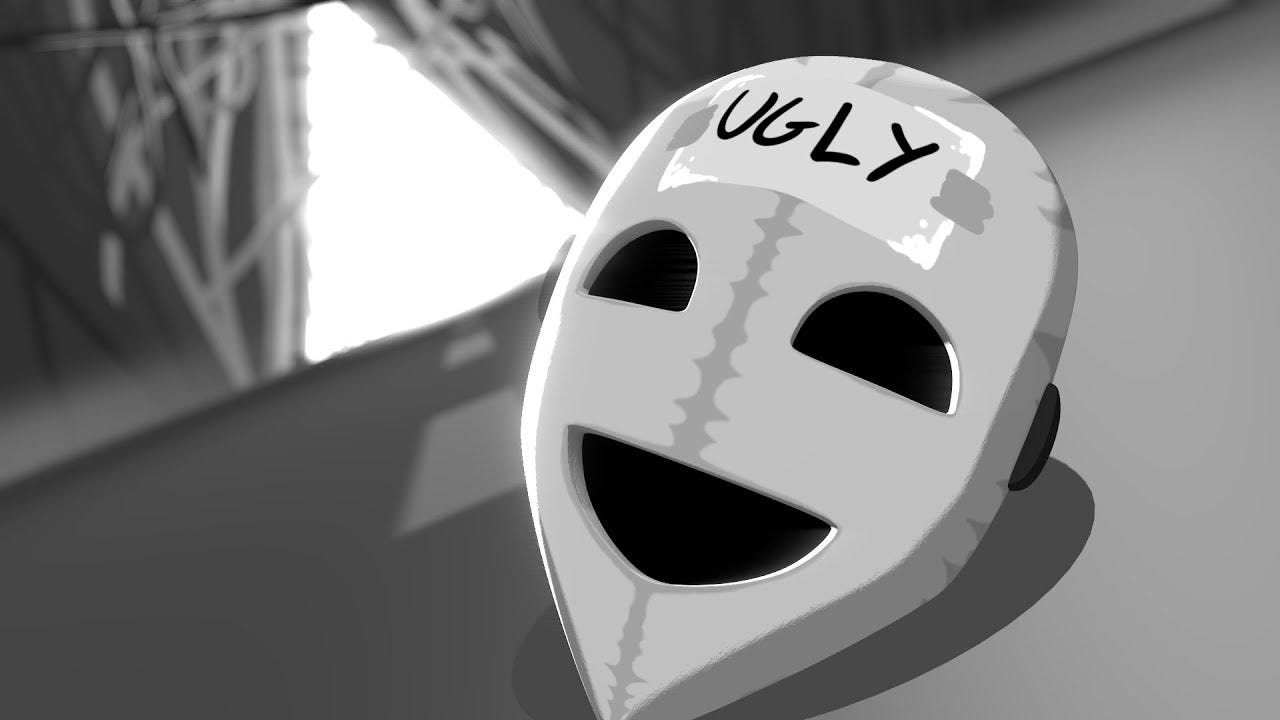
I asked for people to vote on their preferences for my character design through instagram polls.
 All of the designs were liked just as much as each other, so the average result was central, though the least liked was option C.
The results were that out of 30 submissions:
8 liked option A, 4 liked option B, 1 liked option C, 12 liked option D, and 5 liked E.


I did something similar with the character design for the human but there were not as many responses.
Out of the three characters, most people preferred the large, inverted eyes. Most people preferred the outfit with the shirt and vest. Finally, most people liked the neat, short-cut hairstyle.+

Subscribe to:
Comments (Atom)
Evaluation D&AD
As a final result, I think we had definitely produced the work that we aimed to. It was clear and stuck to the newer Giffgaff emoji kind of...

-
 KEY: United Kingdom - Spend £2,516.37 - Left £1,833.63 United States - Spend £4,014.93 - Left £3570.89 Canada - Spend £3,189.53 - Left £1,34...
 -
Wow this shot took me for a ride... 2/1/20 This was the day that I received the sketch layer for Sandy's walk from Ayesha. We had previ...
-
 LinkedIn After talking to Mike about my progress in 502, it was suggested that I make my LinkedIn about info directed more about my aspirat...
